This weekend is the YHH Squirtacular tourney in Blaine. I hate to give anything from Wisconsin props but these Madison Capitals uniforms are ridiculously awesome.
https://twitter.com/youthhockeyhub/status/1220709848280719362?s=21

<img class="go2wpf-bbcode" src=" https://nhl.bamcontent.com/images/photos/312777418/1536x864/cut.jp g" alt="">
<a href=" https://www.nhl.com/news/springfield-of-ahl-to-be-known-as-ice-o-topes-in-honor-of-simpsons/c-31277721 2" class="bbcode_url"> https://www.nhl.com/news/springfield-of-ahl-to-be-known-as-ice-o-topes-in-honor-of-simpsons/c-312777212

<a href=" https://www.nhl.com/news/springfield-of-ahl-to-be-known-as-ice-o-topes-in-honor-of-simpsons/c-31277721 2" class="bbcode_url"> https://www.nhl.com/news/springfield-of-ahl-to-be-known-as-ice-o-topes-in-honor-of-simpsons/c-312777212
I want one of those!
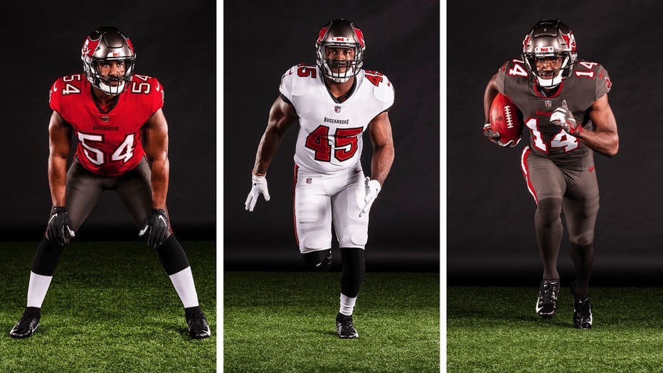
Well done, Tampa. Well done.
<img class="go2wpf-bbcode" src="
1" alt="">
Well done, Tampa. Well done.

<img class="go2wpf-bbcode" src="
1" alt="">
Not enough orange and white. Go back to the creamsicle jerseys. Still not bad
They look basically the same as I can remember when I had a Warrick Dunn jersey the year before they won the SB? Is there something special I'm missing?
They look basically the same as I can remember when I had a Warrick Dunn jersey the year before they won the SB? Is there something special I'm missing?
Nope, just well done for realizing their current ones were an atrocity, and going back to the ones that worked in the 90s. I'm not an 80s kid, so I have no nostalgic connection to the creamsicles ![]()
They're still fugly.
Falcons did a rehashing, the throwback looks sweet, the rest, ok.
<img class="go2wpf-bbcode" src=" https://pbs.twimg.com/media/EWIdOeOWkAE-78D?format=jpg&name=larg e" alt="">
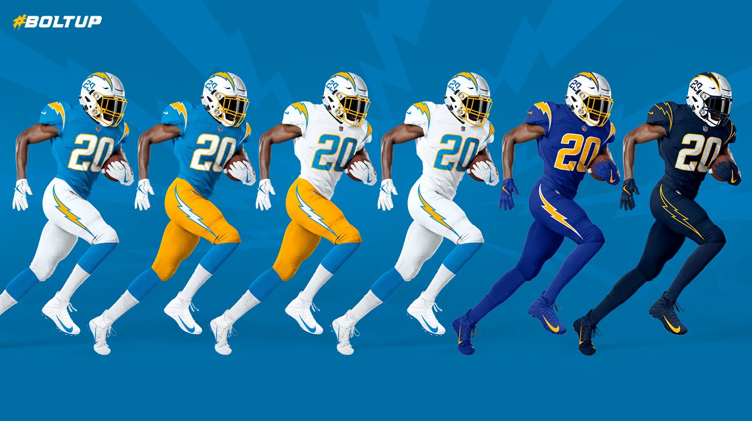
I really wish they didn't have the numbers on the helmets, makes it too busy IMO. These are frustratingly close to being really great.
My favorites are definitely the bookends. The powder blue with white pants is great, and the dark blues with the outlined bolt is pretty cool.
I really wish they didn't have the numbers on the helmets, makes it too busy IMO. These are frustratingly close to being really great.
My favorites are definitely the bookends. The powder blue with white pants is great, and the dark blues with the outlined bolt is pretty cool.
They only use the powder Blue on special occasions they refuse to use them regularly
Aloha!

I really wish they didn't have the numbers on the helmets, makes it too busy IMO. These are frustratingly close to being really great.
My favorites are definitely the bookends. The powder blue with white pants is great, and the dark blues with the outlined bolt is pretty cool.
I thought the NFL severely limited the number of uniforms that can be used during a season?
It's more the helmets since those need to be perfectly form fitted. Swapping out jerseys and pants has always been fine.
I could have sworn there was a limit of 3 for NFL teams but I haven't paid very close attention so it wouldn't surprise me to be wrong about that.
I believe the NHL has a rule like this, but I haven't heard of it for the NFL.
I like everything about those Chargers unis. The gold pants are especially nice.

I really wish they didn't have the numbers on the helmets, makes it too busy IMO. These are frustratingly close to being really great.
My favorites are definitely the bookends. The powder blue with white pants is great, and the dark blues with the outlined bolt is pretty cool.
Terrific set, especially the three on the left. Personally, I like the numbers on the helmets; what I grew up seeing through the early 70's.
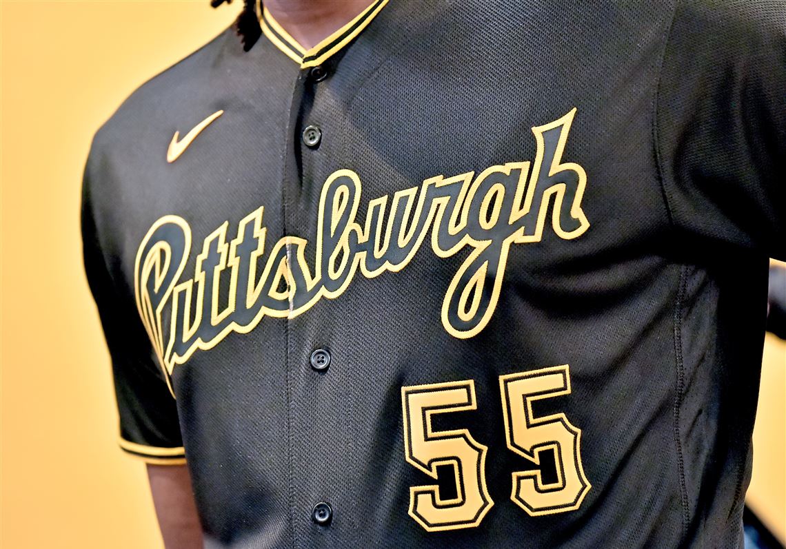
Might be an unpopular opinion, but I dig these Pirates uniforms.
<img class="go2wpf-bbcode" src=" https://9b16f79ca967fd0708d1-2713572fef44aa49ec323e813b06d2d9.ssl.cf2.rackcdn.com/1140x_a10-7_cTC/20200124mfpiratessports03-2-1579899857.jp g" alt="">
Might be an unpopular opinion, but I dig these Pirates uniforms.

<img class="go2wpf-bbcode" src=" https://9b16f79ca967fd0708d1-2713572fef44aa49ec323e813b06d2d9.ssl.cf2.rackcdn.com/1140x_a10-7_cTC/20200124mfpiratessports03-2-1579899857.jp g" alt="">
As do I.
Those definitely work nicely.
B1G refs... corrupt, or just incompetent?
They are really nice, I also like these Padres unis:

<img class="go2wpf-bbcode" src=" https://ewscripps.brightspotcdn.com/dims4/default/1894a65/2147483647/strip/true/crop/900x506+0+58/resize/1280x720!/quality/90/?url=http%3A%2F%2Fewscripps-brightspot.s3.amazonaws.com%2F6e%2F8b%2Fea46476e4de48b2582b9a503221a%2Fpadres-angels-machado-072020-ap.jp g" alt="">
I'd like to see the Pirates getup from further away - not a big fan in the close-up. The Padres' one though is solid.
I'd like to see the Pirates getup from further away - not a big fan in the close-up. The Padres' one though is solid.
These are their away uniforms this season. I really like them both, when usually I'm a curmudgeon that thinks away teams should only be in gray

<img class="go2wpf-bbcode" src=" https://triblive.com/wp-content/uploads/2020/01/2234399_web1_PTR-Bucs03-012520.jp g" alt="">
Yes those are quite nice.
I think it is pretty cool that Pittsburgh uses the same color scheme across the 3 major sports teams. Are there any other cities that do that? Is there significance to those colors for Pittsburgh?
I think it is pretty cool that Pittsburgh uses the same color scheme across the 3 major sports teams. Are there any other cities that do that? Is there significance to those colors for Pittsburgh?
The city's flag is black and gold, matching William Pitt's coat of arms.
I think it is pretty cool that Pittsburgh uses the same color scheme across the 3 major sports teams. Are there any other cities that do that? Is there significance to those colors for Pittsburgh?
Seattle?
I like the black unis, but I don't like "Stencil" numbers on any uniform. Logo or number, outlined by the uniform color and then the piping around THAT is just not a look I care for. But I'm old-fashioned, admittedly.
I like the black unis, but I don't like "Stencil" numbers on any uniform. Logo or number, outlined by the uniform color and then the piping around THAT is just not a look I care for. But I'm old-fashioned, admittedly.
I really don’t like the numbers of the black uniforms. Everything else is fine.
These are just concepts, but interesting. I don’t love the Vikings helmet design (I prefer the simplicity of the horns) but I find it hysterical that the packers G was made in a cheese design. ?
https://uni-watch.com/2020/10/17/bowen-hobbs-redesigns-the-nfl-volume-iii/
Those Lions uniforms are straight gas. Also like what he did with the Titans concept.
Stars new alternate jersey for this year.
[media] https://twitter.com/DallasStars/status/1321469550509150209 [/media]
I was recently informed by a GPLer that I'm related to Airey
Are they glow in the dark or just neon green?
Social media director for Dartmouth’s still got it:
https://twitter.com/dartmouth_mih/status/1321505834413817858?s=21
[media] https://twitter.com/mnwild/status/1327657675581165568 [/media]
I was recently informed by a GPLer that I'm related to Airey
Love that the screen capped the select all box and posted it.
Certainly better than the Christmas colors The Devils gave up on years ago.
It honestly just rubs a bit more salt in the wound. Love those colors and all, but seeing them with that logo just twists the knife.
I’m sure they’ll serve their purpose (money) very well though.
Some head scratchers with some of those. I like the Flames, Canadians, Kings, Rangers and Pens. Not a fan of Devils, Blues, Wild, Jets, Ducks and Vegas. I love the whole Whalers and Quebec vibe, but not a fan of those current cities using those. Could you imagine if Dallas used the old North Stars logo or Arizona using the old Jets logo?
I was recently informed by a GPLer that I'm related to Airey
These are niceeeee :dup:
I’ve never loved the colors but would consider getting one of these. Are they available yet?!
These are niceeeee :dup:
I’ve never loved the colors but would consider getting one of these. Are they available yet?!
The Hockey Lodge online has them now.
I was recently informed by a GPLer that I'm related to Airey
For only 180$ ??
For only 180$ ??
It's labeled as being Authentic. Assuming it actually is, that's not really a bad price. $130 for the Replicas
B1G refs... corrupt, or just incompetent?
It honestly just rubs a bit more salt in the wound. Love those colors and all, but seeing them with that logo just twists the knife.
I’m sure they’ll serve their purpose (money) very well though.
Same here. I loved the North Stars growing up which is why I've never accepted the Wild as my team. I actually root against the Wild because I fear that hard core Wild fans will become even more obnoxious than Packers fans should the Wild ever win a Stanley Cup.
